In descriptive statistics, a box plot or boxplot (also known as a box and whisker plot) is a type of chart often used in explanatory data analysis.
Box plots visually show the distribution of numerical data and skewness by displaying the data quartiles (or percentiles) and averages.
Box plots show the five-number summary of a set of data: including the minimum score, first (lower) quartile, median, third (upper) quartile, and maximum score.

How to read a boxplot
- Interquartile Range (IQR): The box plot shows the middle 50% of scores (i.e., the range between the 25th and 75th percentile).
- Whiskers: The upper and lower whiskers represent scores outside the middle 50% (i.e., the lower 25% of scores and the upper 25% of scores).
- Minimum Score: The lowest score, excluding outliers (shown at the end of the left whisker).
- Lower Quartile: Twenty-five percent of scores fall below the lower quartile value (also known as the first quartile).
- Median: The median marks the mid-point of the data and is shown by the line that divides the box into two parts (sometimes known as the second quartile). Half the scores are greater than or equal to this value, and half are less.
- Upper Quartile: Seventy-five percent of the scores fall below the upper quartile value (also known as the third quartile). Thus, 25% of data are above this value.
- Maximum Score: The highest score, excluding outliers (shown at the end of the right whisker).
- Outliers: Points beyond the whiskers, indicating potential extreme values.
Why are box plots useful?
Quick summary of key statistics
By displaying the median, interquartile range, and outliers at a glance, boxplots provide a concise snapshot of a dataset’s center and spread.
Box plots divide the data into sections containing approximately 25% of the data in that set.
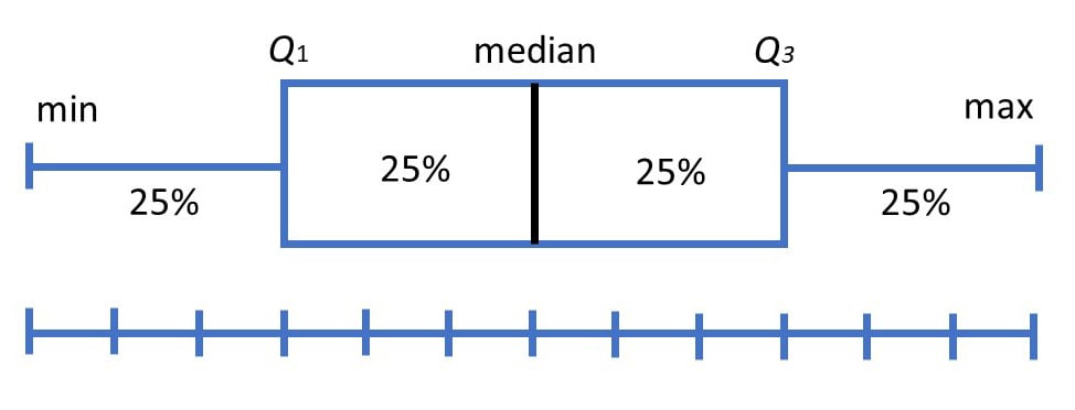
Box plots are useful as they provide a visual summary of the data enabling researchers to quickly identify mean values, the dispersion of the data set, and signs of skewness.
Note that the image above represents data that has a perfect normal distribution, and most box plots will not conform to this symmetry (where each quartile is the same length).
Average score of a data set
The median is the average value from a set of data and is shown by the line that divides the box into two parts. Half the scores are greater than or equal to this value, and half are less.
Skewness of a data set
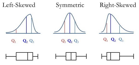
The box plot shape will show if a statistical data set is normally distributed or skewed.
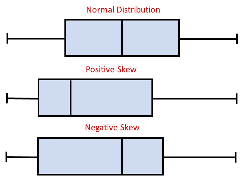
When the median is in the middle of the box, and the whiskers are about the same on both sides of the box, then the distribution is symmetric.
When the median is closer to the bottom of the box, and if the whisker is shorter on the lower end of the box, then the distribution is positively skewed (skewed right).
When the median is closer to the top of the box, and if the whisker is shorter on the upper end of the box, then the distribution is negatively skewed (skewed left).
Dispersion of a data set
In statistics, dispersion (also called variability, scatter, or spread) is the extent to which a distribution is stretched or squeezed.
The smallest and largest values are found at the end of the ‘whiskers’ and are useful for providing a visual indicator regarding the spread of scores (e.g., the range).
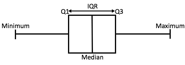
The interquartile range (IQR) is the box plot showing the middle 50% of scores and can be calculated by subtracting the lower quartile from the upper quartile (e.g., Q3−Q1).
Show outliers within a data set
An outlier is an observation that is numerically distant from the rest of the data.
When reviewing a box plot, an outlier is defined as a data point that is located outside the whiskers of the box plot.
Outliers can be genuine rare events (e.g., a patient who recovers extraordinarily quickly) or the result of data-entry mistakes, faulty instruments, or other errors.
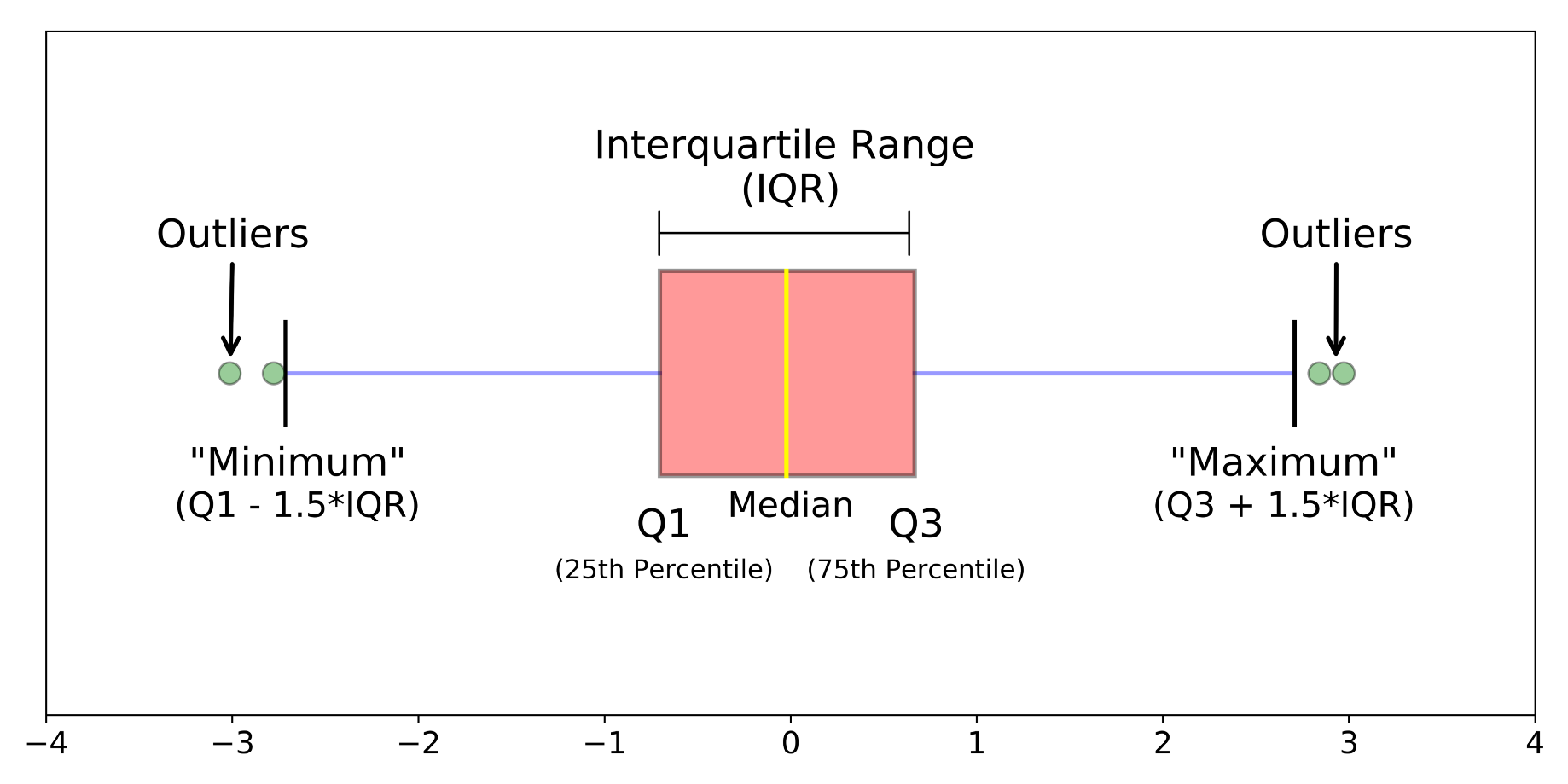
Source: https://towardsdatascience.com/understanding-boxplots-5e2df7bcbd51
For example, outside 1.5 times the interquartile range above the upper quartile and below the lower quartile (Q1 – 1.5 * IQR or Q3 + 1.5 * IQR).
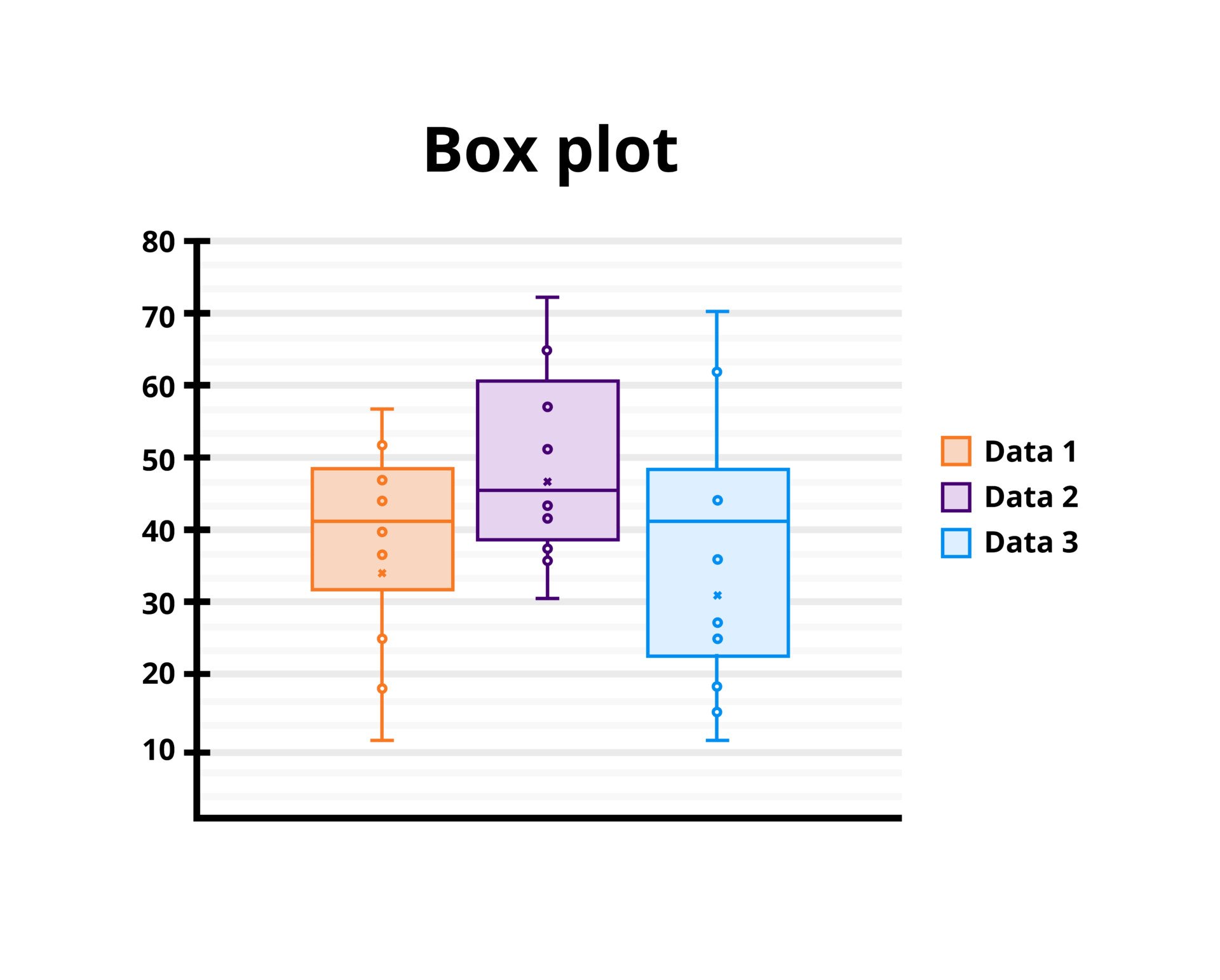
Box plots are useful as they show simple, side-by-side comparisons
Boxplots make it easy to compare multiple data groups (e.g., different populations or experimental conditions) by aligning the “boxes” next to each other, highlighting differences in medians, overall spread, or outlier prevalence.
How to compare box plots
Box plots are a useful way to visualize differences among different samples or groups. They manage to provide a lot of statistical information, including — medians, ranges, and outliers.
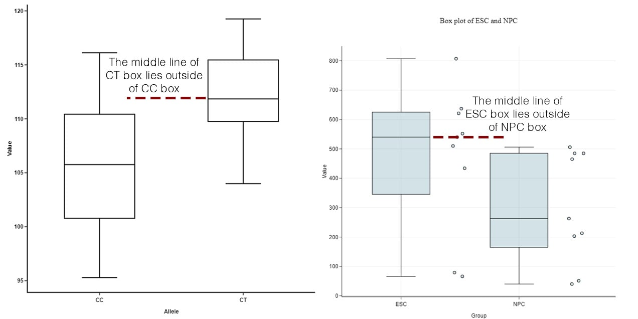
Step 1: Compare the medians of box plots
Compare the respective medians of each box plot. If the median line of a box plot lies outside of the box of a comparison box plot, then there is likely to be a difference between the two groups.
Source: https://blog.bioturing.com/2018/05/22/how-to-compare-box-plots/
Step 2: Compare the interquartile ranges and whiskers of box plots
Compare the interquartile ranges (that is, the box lengths) to examine how the data is dispersed between each sample. The longer the box, the more dispersed the data. The smaller, the less dispersed the data.
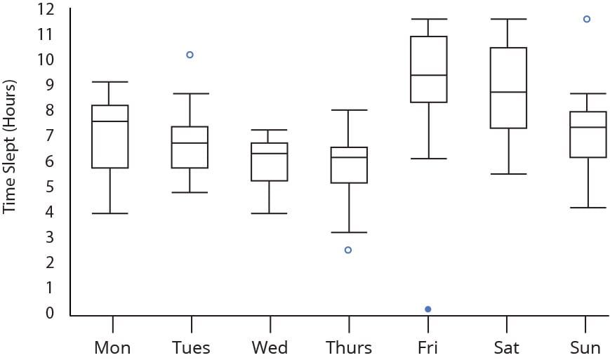
Next, look at the overall spread as shown by the extreme values at the end of two whiskers.
This shows the range of scores (another type of dispersion). Larger ranges indicate wider distribution, that is, more scattered data.
Step 3: Look for potential outliers (see the above image)
When reviewing a box plot, an outlier is defined as a data point that is located outside the whiskers of the box plot.
Because the mean is sensitive to extreme values, a single outlier can substantially shift the average, potentially giving a misleading picture of the dataset.
Recognizing this effect is essential for accurate data interpretation.
Step 4: Look for signs of skewness
If the data do not appear to be symmetric, does each sample show the same kind of asymmetry?

tep-by-Step Construction
-
Gather and Sort Your Data:
- Start by listing all the numbers in your dataset.
- Example: 3, 5, 7, 10, 12, 14, 18
- Now, put those numbers in order from smallest to largest. This makes it much easier to find the important values.
-
Find the Minimum and Maximum:
- The minimum is the smallest number in your list.
- The maximum is the largest number.
- In our example (3, 5, 7, 10, 12, 14, 18):
- Minimum = 3
- Maximum = 18
-
Calculate the Median (The Middle Value):
- The median is the middle number when your data is sorted.
- If you have an odd number of values, it’s the one right in the center.
- If you have an even number, you average the two middle numbers.
- In our example (3, 5, 7, 10, 12, 14, 18):
- There are 7 numbers, so the middle one is the 4th one.
- Median = 10
-
Find the First Quartile (Q1) and Third Quartile (Q3):
- Q1 is the median of the lower half of your data (the numbers below the overall median).
- Q3 is the median of the upper half of your data (the numbers above the overall median).
- Important: when finding Q1 and Q3, if there is an even amount of numbers in the upper or lower half, you must average the two center numbers.
- From our example:
- Lower half: 3, 5, 7 (below the median 10)
- Q1 is the middle of (3, 5, 7). That’s 5. So Q1 = 5.
- Upper half: 12, 14, 18 (above the median 10)
- Q3 is the middle of (12, 14, 18). That’s 14. So Q3 = 14.
-
Calculate the Interquartile Range (IQR):
- The IQR tells you how spread out the middle 50% of your data is.
- IQR = Q3 – Q1
- For our example:
- Q3 = 14
- Q1 = 5
- IQR = 14 – 5 = 9
-
Identify Outliers (Using the 1.5 × IQR Rule):
- Outliers are numbers that are very different from the rest.
- Lower Outlier Cutoff = Q1 – (1.5 × IQR)
- Upper Outlier Cutoff = Q3 + (1.5 × IQR)
- Any numbers below the Lower Cutoff or above the Upper Cutoff are outliers.
- Using our example:
- Lower Cutoff = 5 – (1.5 × 9) = 5 – 13.5 = –8.5
- Upper Cutoff = 14 + (1.5 × 9) = 14 + 13.5 = 27.5
- Since our minimum is 3 and our maximum is 18, we have no outliers.
-
Draw the Boxplot:
- Draw a number line that covers the range of your data (from minimum to maximum).
- Mark Q1, the median, and Q3 above the number line to create the “box.”
- Draw the “whiskers.”
- The left whisker goes from Q1 to the smallest value within the lower outlier cutoff.
- The right whisker goes from Q3 to the largest value within the upper outlier cutoff.
- If you have outliers, plot them as individual points beyond the whiskers.
- Remember to use visual aids along with these steps.

Practice Questions
Tips for Success
- Always sort your data before finding quartiles.
- Use (Q3 − Q1) for the IQR, then multiply by 1.5 to find the outlier “cut-off.”
- If an outlier exists, plot it as a separate point outside the whiskers.
- Label your axes carefully and include a title for clarity
Question 1: Memory Test Scores
A researcher measures short-term memory test scores for 15 participants. Each participant completes a recall test scored out of 30 points. The data are:
23, 16, 19, 27, 14, 29, 22, 18, 12, 30, 25, 20, 15, 28, 17
- Sort the data.
- Find the minimum, Q1, median, Q3, and maximum.
- Calculate the interquartile range (IQR).
- Determine if there are any outliers using the 1.5 × IQR rule.
- Draw a boxplot of the data.
- Interpret your findings.
- Are the scores clustered, spread out, or skewed?
Question 2: Stress Scale Scores
A psychologist uses a stress scale ranging from 0 (no stress) to 40 (extreme stress). Fifteen patients reported the following scores:
6, 9, 15, 15, 18, 22, 5, 27, 32, 33, 10, 14, 16, 8, 40
- Order the scores and calculate the median.
- Find Q1 and Q3, then compute the IQR.
- Determine lower and upper outlier boundaries (Q1 − 1.5 × IQR, Q3 + 1.5 × IQR).
- Draw a boxplot, labeling any outliers as individual points.
- Discuss any potential reasons for outliers on a stress scale (e.g., unique personal situations).
Question 3 Anxiety Scores Before and After Therapy
A clinical psychologist measures anxiety in a group of clients before and after a short therapy program. Anxiety is scored from 0 to 50. The data are:
Before: 10, 12, 15, 15, 24, 20, 28, 31, 35, 15
After: 7, 10, 10, 17, 20, 15, 21, 30, 28, 10
- Construct a boxplot for the “Before” scores.
- Construct a separate boxplot for the “After” scores (on the same scale).
- Compare the distributions:
- Which group has a higher median?
- Which group has a wider spread (IQR)?
- Are there any outliers in either group?
- Interpret the difference in anxiety levels. Based on the boxplots, does therapy appear to have an effect?
Limitations
- Lack of Detail About Distribution Shape: Although boxplots can show skewness to some extent (through asymmetry in the box or whiskers), they do not reveal whether a distribution is unimodal, bimodal, or has other distinct peaks.
- Limited Information on Data Density: A boxplot will not show you how many data points lie at different values within each quartile. Two datasets with the same boxplot could still have very different internal distributions.
- Context for Outliers: While outliers are marked, boxplots alone do not explain why those points are far from the bulk of the data—further context or other visualizations might be necessary to understand anomalies.
Strengths

- Quick Summary of Key Statistics: By displaying the median, interquartile range, and outliers at a glance, boxplots provide a concise snapshot of a dataset’s center and spread.
- Simple, Side-by-Side Comparisons: Boxplots make it easy to compare multiple data groups (e.g., different populations or experimental conditions) by aligning the “boxes” next to each other, highlighting differences in medians, overall spread, or outlier prevalence.
- Outlier Detection: Because boxplots explicitly plot values beyond 1.5 × IQR (or another chosen threshold) as separate points, unusual or extreme values are immediately visible.


BSc (Hons) Psychology, MSc Psychology of Education
Associate Editor for Simply Psychology
Olivia Guy-Evans is a writer and associate editor for Simply Psychology, where she contributes accessible content on psychological topics. She is also an autistic PhD student at the University of Birmingham, researching autistic camouflaging in higher education.

Chartered Psychologist (CPsychol)
BSc (Hons) Psychology, MRes, PhD, University of Manchester
Saul McLeod, PhD, is a qualified psychology teacher with over 18 years of experience in further and higher education. He has been published in peer-reviewed journals, including the Journal of Clinical Psychology.